How to Design a Varsity Letterman Jacket Patch
A practical guide to designing chenille varsity patches: sizing, letter shapes, colour pairing, placement on the jacket, and the mistakes that ruin a good design.
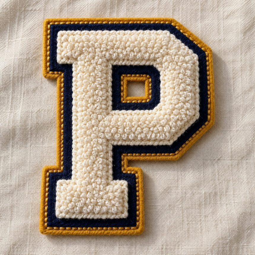
A letterman jacket patch is one of the few things people genuinely keep for decades. It is worth getting right, and the difference between a good one and an awkward one usually comes down to decisions made before anything is stitched.
Here is how to make those decisions well.
Start with placement, not the design
Most people design the patch first and then work out where it goes. Do it the other way round. The position dictates the size, and the size dictates what the design can contain.
The chest letter. The classic. A single large initial on the left chest, usually 5 to 7 inches tall. This is the piece that makes a jacket read as a letterman jacket at a glance.
The back patch. Room for a full team name, mascot, or a school crest. Typically 10 to 12 inches wide. This is where illustration belongs, if you want any.
The sleeve. Graduation year, jersey number, or a small award. Usually 3 to 4 inches. Sleeves curve, so keep these designs simple and compact.
The shoulder or upper back. Arched lettering — a team name curved above a central design. Looks sharp, but the arch has to be drawn properly rather than bent afterwards.
Decide the position first and the rest becomes much easier.
Size: bigger than you think
Chenille has a genuine minimum size, and it is larger than people expect.
The yarn is thick. Below about 3 inches, the loops crowd together and the shape starts to lose its edges. A 2-inch chenille letter does not look like a small letterman patch — it looks like a blob.
Practical guidance:
| Element | Minimum | Looks best at |
|---|---|---|
| Single chest letter | 4” | 5 – 7” |
| Team name (chenille) | 6” wide | 8 – 12” |
| Back patch | 8” | 10 – 14” |
| Sleeve number | 3” | 3 – 4” |
If your design needs to be smaller than these, chenille is the wrong material. Embroidery holds detail far better at small sizes, and the two can sit on the same jacket without clashing.
Letter shape matters more than font
Chenille letters are cut from felt and filled with yarn, which means thin strokes do not survive. A delicate script font that looks elegant on screen will come back as a wobbly, fragile shape with loops falling off the edges.
What works:
- Block letters. Heavy, square, generous stroke width. The classic varsity choice for good reason.
- Slab serifs. The thick rectangular feet give the letter a solid base.
- Simple collegiate faces. Wide, bold, minimal contrast between thick and thin.
What does not:
- Thin script or handwriting fonts
- Anything with hairline strokes
- Highly condensed faces — the counters (the holes in letters like P, A, O) close up
- Outline-only fonts, since there is nothing to fill
A useful test: shrink your letter to one inch on screen. If you can still tell what it is, it will stitch. If it turns to mush, so will the patch.
Colour: three is the sweet spot
A traditional varsity patch uses three colours, and there is a reason that convention stuck.
- The base felt — the background the letter sits on
- The chenille yarn — the letter itself
- The border felt — the outline that separates the patch from the jacket
The classic arrangement is a dark base, a light letter, and a contrasting border. Navy base, cream letter, gold border. Black base, white letter, red border. The contrast is what makes the letter readable from across a room, which is the entire job of the thing.
Two colours is fine if you want something cleaner — just make sure the letter and base are far apart in tone, not two shades of similar brightness.
More than three starts to muddle. Chenille is a bold material. It does not reward subtlety.
One practical point: check your colour against the jacket, not against white. A cream border looks crisp on paper and disappears on a cream sleeve. Ask your supplier what the patch will sit on before finalising.
Mixing chenille with embroidery
This is the combination most people do not know is available, and it solves the biggest limitation of chenille.
Chenille cannot hold fine detail. Embroidery can. So the standard approach on a serious jacket is:
- Chenille for the big letter or number
- Embroidery for the team name, year, or any small text stitched across or beneath it
You get the thick tactile letter and readable detail. A chenille “P” with “PATRIOTS 2026” embroidered across the crossbar is a far better patch than either element alone.
If you want this, say so on your quote request. It is a normal request and not usually much more expensive.
Backing: sew it on
Chenille patches are heavy. They go on garments that get worn hard, sat in, thrown in bags, and washed.
Sew-on is the right answer, and it is the traditional one. A stitched border will outlast the jacket.
Iron-on backing is available, and it works — but on a large, heavy chenille patch the adhesive will eventually lift at the corners. If you want iron-on for convenience, iron it on to position it, then run stitches around the edge. Two minutes of work turns a temporary bond into a permanent one.
Velcro is worth considering if the jacket will be passed down, or if players change year to year — one loop panel on the chest, and the letter swaps out.
The five mistakes that ruin a good design
1. Designing too small. The most common by a distance. Chenille needs room.
2. Picking a font before checking the strokes. Beautiful on screen, unstitchable in yarn.
3. Insufficient contrast. A mid-grey letter on a navy base disappears at any distance.
4. Forgetting the jacket colour. The border has to separate the patch from the garment, and that only works if it contrasts with the garment too.
5. Approving the proof too quickly. This is the expensive one. Check the spelling. Check the year. Check it letter by letter, ideally with someone else looking too. Changes are free before production and impossible after.
A worked example
A high school needs 40 jackets kitted out:
- Chest: 6-inch chenille “W”, cream yarn on navy felt, gold border
- Back: 11-inch chenille “WARRIORS” arched, same colours
- Sleeve: 3.5-inch embroidered “2026” — embroidered rather than chenille because it is small and needs to be legible
- Backing: sew-on throughout
That combination is conventional, and conventional is correct here. A letterman jacket is not the place for design experiments — it is a piece people expect to look a specific way, and it should.
Before you order
- Position chosen for each patch
- Size checked against the minimums above
- Font tested at one inch
- Three colours picked, checked against the jacket
- Decided what should be embroidered rather than chenille
- Spelling and year checked by a second person
- Sew-on backing confirmed
Ready to design yours? Request a free quote — send a sketch, a photo of an old jacket, or just describe it. We will send back a digital proof showing exactly how it will look before anything is made, and revise it as many times as you need.
Learn more about custom chenille and varsity patches.